Let’s be clear: web design is an involved discipline that can take a lifetime to master. As if that weren’t hard enough, it’s also a field that’s evolving every second as technology keeps advancing—imagine da Vinci’s frustration if people complained the Mona Lisa “looked old” after just five years.
We’ve just sent you your first lesson.
Web design is something that pretty much everyone on the managerial end of a business has to deal with, but only design professionals truly understand. If you want a great web design, you have to learn the basics, so you can communicate want you want. Even if you’re hiring a professional to design your page for you, you still need some background information to discern a talented web designer from a mediocre one and explain what you need them to do.
We know how hard it is for non-designers to get the hang of this whole web design thing, so we created this handy guide to walk you through the basics. Here are the top ten web design tips you need to know about (plus some useful dos and don’ts), divided into three categories: Composition, Aesthetics and Functionality. Whether you’re hiring a designer or DIY-ing, check your final web design for these ten fundamentals.
Composition
—
1. Clear out the clutter.
First, let’s address one of the most common beginner mistakes in web design: a cluttered screen. Most people have a list of everything they want on their website, and without knowing any better, they just throw it all on screen—and on the same page.
 Web design by Slaviana
Basically, every element you add to your web design waters down all the others. If you include too many distracting elements, your user doesn’t know where to look and you lose a coherent experience. By contrast, if you only include the necessary elements, those elements are more potent since they don’t have to share center stage.
More white space means less clutter and that’s what really matters in a minimalist, clean web design.
See how the home screen in the Intenz example by Top Level designer Slaviana features nothing but the essentials: navigation menu, logo, tagline, main call-to-action (CTA) and some sparse imagery for atmosphere and to show off the product. They feature other information of course, but present it later so their screens are never too crowded. It’s the visual equivalent of pacing.
For a web design to be effective, it needs to be streamlined—there must be a clear path or paths for the user to follow. There are many different ways to achieve this (some explained below), but the first step is always to create space for high-priority elements by removing low-priority ones.
Do:
- Trim the fat. Audit your designs for the essentials. If an element doesn’t add to or improve the overall experience, remove it. If an element can live on another screen, move it there.
- Limit pull-out menus. Pull-out menus (drop-downs, fold-outs, etc.) are a good way to reduce clutter, but don’t just sweep your problems “under the rug.” If possible, try to limit these hidden menus to seven items.
Don’t:
- Use sidebars. New visitors probably won’t use them. Plus, if all the options don’t fit in your main navigation menu, you need to simplify your navigation structure anyway (see below).
- Use sliders. The motion and new images in a slider are distracting and they weaken your control over what your users see. It’s better to showcase only your best images, all of the time.
2. Use ample white space.
How are you going to fill all that space you created after clearing out the clutter? Might we suggest filling it with nothing?
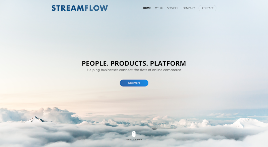 Web design by Hitron
Negative space (a.k.a. white space) is the technical term in visual arts for areas in an image that do not attract attention. Typically, these are empty or blank, like a cloudless sky or a monochrome wall. Although boring on its own, when used artistically, negative space can complement and enhance the main subject, improve legibility and make the image easier to “take in.”
My mantra is: simple is always better. It draws attention to what’s important for the user almost instantly. Also, simple is attractive.
In the Streamflow example by Top Level designer Hitron, the tagline and CTA take the main focus, not because they’re flashy or garish, but because of all the negative space around them. This landing screen makes it easier for the user to understand what the company does and where on the site to go next. They include gorgeous imagery of the clouds, too, but in a beautiful, minimalistic way—a clever composition with plenty of strategic negative space.
Do:
- Surround your most important elements with negative space. The more negative space around something, the more attention it receives.
- Avoid boring layouts with secondary visuals. Other aesthetic elements like color or typography (see below) can pick up the slack visually when there’s a lot of negative space.
Don’t:
- Emphasize the wrong element. Surround only top-priority elements with negative space. For example, if your goal is conversions, surround your email or sales CTA with negative space—not your logo or sales pitch.
- Use busy backgrounds. By definition, backgrounds are supposed to go largely unnoticed. If your background doesn’t have enough negative space, it will steal attention from your main elements.
3. Guide your user’s eyes with visual hierarchy.
If using a technical term like “negative space” didn’t phase you, what do you think of “visual hierarchy”? It refers to using different visual elements like size or placement to influence which elements your user sees first, second or last. Featuring a big, bold title at the top of the webpage and tiny legal information at the bottom is a good example of using visual hierarchy to prioritize certain elements over others.
 Web design by Canvas Creation
Web design isn’t just about what you add to your website, but how you add it. Take CTA buttons; it’s not enough that they’re simply there; skilled designers place them deliberately and give them bold colors to stand out and suggestive text to encourage clicks. Elements like size, color, placement and negative space can all increase engagement—or decrease it.
The Shearline homepage example above prioritizes three elements: the title, the image of the product and the call to action. Everything else—the navigation menu, the logo, the explanatory text—all seem secondary. This was a conscious choice from the designer, enacted through a smart use of size, color and placement.
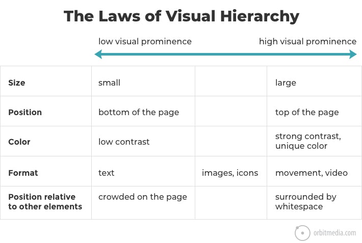 Chart explaining the basics of visual hierarchy. Via Orbit Media Studios.
Review this chart from Orbit Media Studios to l
earn how to attract or repel attention. It’s an oversimplification of a complex topic, but it works well for understanding the bare basics.
Do:
- Design for scannability. Most users don’t read every word of a page. They don’t even see everything on a page. Design for this behavior by making your top priorities hard to ignore.
- Test multiple alternatives. Because visual hierarchy can get complicated, sometimes trial-and-error works best. Create a few different versions (“mockups”) and show them to a new set of eyes for different opinions.
Don’t:
- Use competing elements. Visual hierarchy is about order: first this, then that. Stagger how much attention each one of your essential elements receives so your users’ eyes easily follow a clear path.
- Go overboard. Making elements too big or featuring too much color contrast can have the opposite effect. Use only as many attention-grabbing tactics as you need—and no more.
Aesthetics
—
4. Choose your colors strategically.
Now that you’re familiar with the concepts of good composition, let’s talk about the specifics of that composition. We’ll start with color, a powerful tool for any designer.
 Web design by Desinly
For one thing, every color has a different emotional connotation. If your brand identity is passionate and energetic, an exhilarating red would fit better than a tranquil blue. Aside from choosing the best colors to represent your brand, you also need to use them well, like contrasting colors off each other to establish visual hierarchy.
To use color effectively in web design you have to understand how colors are formed and how they relate to each other. Harmony and balance are the keys to success.
Just look at how Top Level designer Desinly uses orange in the web design for Oil Sands Masterclass above. First, orange is a smart choice because it’s often associated with the heavy operation equipment the company deals with. On top of that, they pair the orange beautifully with a black background to make it stand out more. They also use the same color consistently as a highlight for keywords and buttons, plus they even integrate it into the background photography.
Do:
- Establish a color hierarchy. Use a single color each for your main elements (primary), highlights (secondary) and other less-important elements (background).
- Stick with consistent themes. Once you have an established color palette, stick with it. Keep your primary, secondary, and background colors consistent throughout your entire site.
Don’t:
- Choose your own personal favorite colors. The effects of colors have a proven effect on marketing. Research color theory and don’t waste a critical branding opportunity.
- Clash colors. Choosing colors logically isn’t enough; they also need to go well with each other. Purple and red may both represent your brand well, but the effect is lost if they clash and make an ugly final design.
5. Don’t skimp on photography.
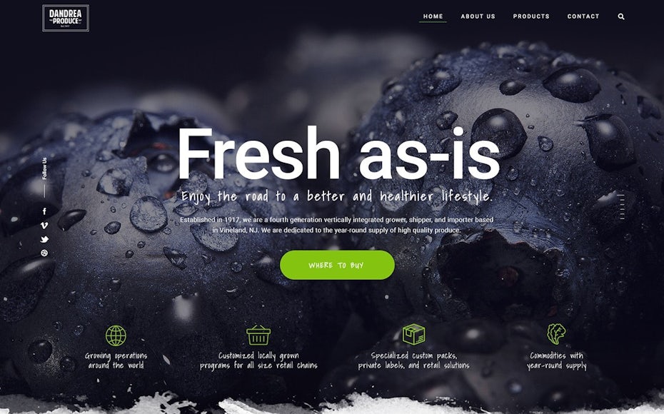 Web design by JPSDesign
Although optional, if you do choose to use real-life photography in your web design, make sure you do it right. Effective, meaningful photography can further your business goals, but poor-quality photos hold you back.
With photography there has to be a connection between branding and concept. Photography can create contrast, attract attention or even draw your eyes to the next section of the page.
Using photography in web design follows many of the same guidelines for good photography in general. A stunning photo hung in an art gallery can be just as stunning on a website, but the mood, style and topics have to coincide. Just look at the tantalizing photograph in Top Level designer JPSDesign’s web design above. Those blueberries would look delicious anywhere, but it’s particularly effective on a grocer’s website.
Do:
- Use real people. Images of people tend to engage users more—especially pictures of your actual staff or actual customers.
- Set the right atmosphere. Photography comes in almost infinite styles, so use the ones that best reflect what your website is going for. If you want a cheerful website, use pictures of people smiling.
Don’t:
- Use obvious stock photography. The operative word there is “obvious.” Stock imagery can be beneficial, but only if the user doesn’t realize it’s stock.
- Use low resolutions. This is the era of high definition, so low-resolution photography makes a brand seem old or unsuccessful. Bonus tip: use a compressor to reduce large file sizes so you can have your cake and eat it too.
6. Optimize typography to build your brand.
While the words you or your copywriter choose are extremely influential, you can also enhance their effectiveness by giving them the right look.
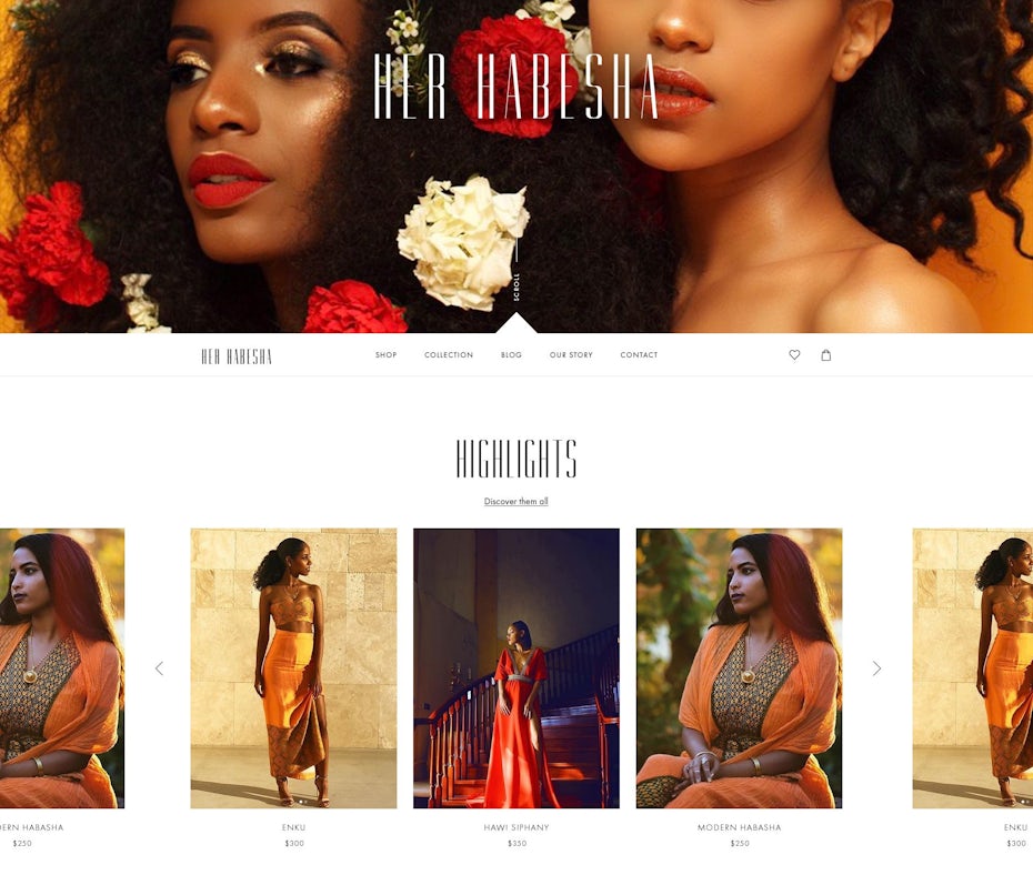 Web design by Studio Ubique
Typography encompasses all the visuals of text, particularly fonts, but also other elements like size, text color, style (italics, bold, etc.) and the spacing between letters, words and lines. All of these impact the visual hierarchy and how your brand is perceived.
Typography can be visually appealing, but if you use distracting fonts, your reader won’t be able to focus on what you’re trying to say and can become irritated with your website. Combining bold typography with a minimalist twist is your winning ticket.
Like colors and photography, typography comes in a diverse array of styles, so pick the one that complements your brand most. To add a little sophistication to the Her Habesha web design above, Top Level designer Studio Ubique uses a striking yet classy typography for the titles. But notice how the typography changes to subtle, modern sans-serifs for the product titles below the pictures to achieve a balance.
Do:
- Use web fonts. For all the variety in fonts, remember to stick with verified “web safe fonts” that can be displayed on most devices and computer monitors. You can learn how to identify them here.
- Study the different types. Do you know what a serif is? Typography is extremely nuanced, so bone up on the five types of fonts to give yourself some context.
Don’t:
- Overuse flashy fonts. Flamboyant, attention-grabbing fonts can work well for titles or standalone words, but are too distracting when used excessively.
- Use the same typography for everything. As in the Her Habesha example, typography works best when it’s balanced. Use different sets for headers, subheaders and body text—and stay consistent with these sets throughout the site.
Functionality
—
7. Streamline navigation.
Finally, we move on to functionality: what your site can do. The conversation about functionality should always start with navigation, the backbone of an
y website.
 Web design by martinthehorrible
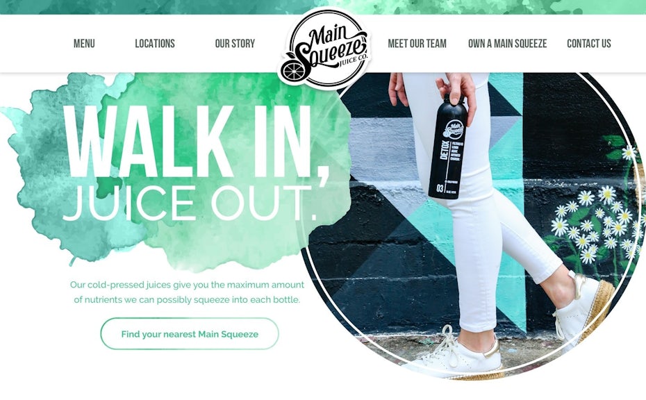
Everyone has their own methods for finding their way around a website. A good web design caters its navigation to its target users so that it feels intuitive—the less users have to think about it, the better.
But that’s no easy feat. It starts with how the entire site is organized: what gets its own page, what gets shunted to a subpage, what is and is not featured in the main menu. Each of these questions need to be answered before the actual web design really takes off.
From there, you have to design your navigation in a way that’s easy for visitors to use, just like in the example above.
Do:
- Find a balance for the amount of options. You want to give users plenty of options, but you don’t want to overwhelm them. Organize your page categories in a way that satisfies these conflicting goals.
- Build navigation around real user data. When shopping for shoes online, some users would search under “clothing” and some under “accessories.” Different user groups have different preferences; build your navigation architecture around how your users think, according to actual data. You can conduct some user tests if you’re in the dark.
Don’t:
- Experiment with unusual formats. While experimentation in healthy doses can elicit some new and great ideas, it’s not recommended for something as vital as navigation. To avoid making your user think too hard, stick to the conventions that users already understand: top header navigation menu, logo linked to the homepage, search bar with magnifying glass icon, etc.
8. Prioritize mobile.
 Web design by Ink’d
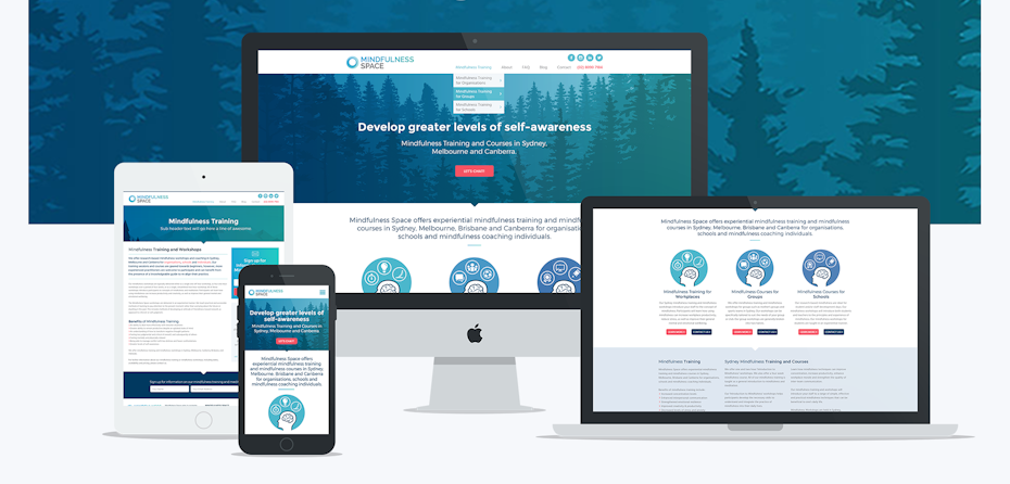
Older (but not old!) people tend to think of web design in terms of desktop screens, but the truth is nowadays people do most of their browsing on mobile devices. That’s why you need to make sure your mobile site is in peak condition. Not just for your user’s sake, but for Google’s as well—the Google algorithm factors in mobile responsiveness to their search rankings.
“Mobile responsiveness” refers to how well your site appears on small-screen devices. If your website is cut off on mobile devices or the images appear in the wrong places, your visitors won’t have a pleasant experience using your website. In addition to smaller screens, mobile devices also have a whole new set of design guidelines, including controls like “swipes,” so don’t assume your desktop version will translate seamlessly.
These days it’s really important to consider a mobile first approach. People tend to use mobile layouts differently than desktop versions, so how the website will perform on mobile is integral to an effective design. Focus on minimal, clean design and eliminate clutter to make it easier for users to focus on the content.
Your mobile version should be a top consideration, right from the start. But that doesn’t mean you can neglect your desktop version. Your website needs to look good no matter what device people use to look at it. Take a look at the web design above to see how Top Level designer Ink’d created variations of a design and—with some slight tweaking—makes it look good on both large and small screens.
Do:
- Design the mobile version first. When designing the mobile version, you work with only the essentials because of the limited screen space. It’s easier to tackle the mobile version first and then add elements to the desktop version rather than designing the desktop version first and then removing elements.
- Prioritize devices based on user data. “Mobile” devices is an umbrella term, but different phone and tablet types have different screen sizes and technical considerations. Refer to user data to see which devices your visitors use most, then prioritize them in the design.
Don’t:
- Use m.dot sites. Those mobile sites that have “m.” in their URL were an early solution to mobile responsive designs before designers knew mobile would overtake desktop. Today, they’re slower to load and damaging to SEO—the best option is to design a single site that works on all relevant devices.
9. Make text easy to read.
 Web design by akorn.creative
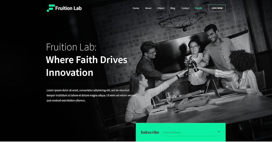
Designing a site specifically around visuals could harm its legibility. If you’re using a font that looks good but no one can read, you’re throwing the baby out with the bathwater.
When we say a website should be easy to read, we’re talking about three different meanings:
- Well-written. The copy text is written to suit your business goals and in a voice that appeals to your audience.
- Aesthetically laid out. The copy text is displayed well, preferably with plenty of space and in digestible blocks that don’t overwhelm the reader.
- Legible. The font and size are both conducive to reading, without strain or double-backing.
While legibility stems mostly from typography, you also must consider composition and structure, as well as how the text interacts with other elements—not to mention the quality of the actual writing.
Having an amazing web design won’t matter if no one can read your text. Top Level designer akorn.creative takes this to heart—see how in the web design above they faded the background photograph to black to create more contrast with the text and make it readable.
Do:
- Pay attention to color pairings. How the text color interacts with the background greatly affects legibility, especially with people who have reading or sight disabilities. Try to stick with contrasting pairs (light and dark tones), and if all else fails, you can always fall back on the classic black-and-white.
- Test designs on different readers. What’s legible to you may not be legible to everyone. Test your designs with various readers to cover all your bases.
Don’t:
- Use cursive or showy fonts for body text. Extravagant fonts work well in making headers and titles more visible, but when the user has to read line-after-line of text, it’s best to stick with a simple font that’s easy on the eyes.
- Include large blocks of text. Large blocks of text intimidate readers, even outside of web design. It’s best to break them up using proactive page formatting or even forced paragraph breaks.
10. Communicate what you want to your designer.
 Web design by akdcreative
Let’s say you have a grand idea for a feature of your website. The better you’re able to explain it to a designer, the more likely the final version will turn out like you envision.
Because it’s a team effort, web design doesn’t just involve technical skills, but also communication skills. Communicating what you want for your site, in detail, is the direct path to getting a satisfactory design. Web designers aren’t mind readers, after all.
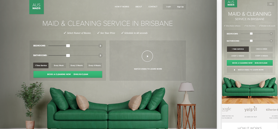
In the AUSMAIDS example by Top Level designer akdcreative above, it seems as if the client knew they wanted a widget that allowed the user to inp
ut the numbers of rooms and the frequency of the visits. The designer took that idea and made it look good. That’s the ideal collaboration between client and designer, and the stellar final product shows it.
Do:
- Plan out what you want beforehand. Either write what you want on paper or create a wireframe. Both help you remember everything and they give your designer a solid jumping off point.
- Keep an open mind. It’s your designer’s job to make your website as great as possible, so keep an open mind to their suggestions, even if it’s different than what you anticipated. Chances are, they know something you don’t.
Don’t:
- Be vague or generic. Using vague and generic terms like “colorful” or “interactive” don’t really say much. Which colors? How do users interact? Be as specific as possible—or agree to leave it up to the designer.
We’ve just sent you your first lesson.
You’ve got this! (Or at least your designer does.)
—
 1998
1998
It’s one thing to read these 10 web design tips, but it’s another thing entirely to apply them to your own site. Fields like color theory, typography, composition and mobile responsiveness are all pretty in-depth, so don’t be discouraged if you’re not getting it all in one sitting. Only professional designers can truly appreciate the nuances of these areas. Hiring someone who understands these web design principles instinctively is usually the safest route to great design.
If you’re looking for a web designer, our designer search tool lets your browse our community of 1.4 million designer from all over the world. You can filter your searches by designer skill level, specialization, or even the types of industries in which they specialize.

