Within five seconds of landing on your website, can your visitors determine what your company does? Could users easily navigate to the blog if they need to? Is the layout of your pricing easy to understand? Does your website have a low bounce rate?
If you’re finding yourself answering ‘no’ to these questions, it might be time to take a hard look at the way you’ve been designing and optimizing your website.
A website truly excels when it has a design that feeds into your website’s user experience, functionality, and appropriately complements your content.
It can be super easy for even a professional website designer to neglect these things, thinking these updates are the lowest thing to worry about on your totem pole of website priorities. However, a successful website has both high performing content and an exceptional user experience that ensures your design goes above and beyond.
The last thing you want is to be spending time writing some amazing content on your blog or service pages, only for it to go unnoticed due to design flaws, navigation issues, or confusing layouts, or missed conversion opportunities.
But the umbrella of website user experience has a lot under it, and it can be challenging to understand all that’s under it while figuring out the most important things to tackle.
1. Have a plan
Now that you’ve acknowledged that your site likely needs some improvements, it’s time to work your way backward and create a plan detailing how you’ll tackle them.
Start by mapping out your customer journey from the first time someone visits your website to the moment they become a customer.
When doing this, think about which pages are they going to view, what content are they going to read, and what offers are they going to convert on. Understanding this will help you design a site that actually helps nurture leads through the sales funnel.
I’ve always liked Leadfeeder’s customer journey map as a great example. You don’t need to make it as graphical as they did, but it gets the point across. It illustrates what users do when visiting their website and what commonalities occur between those who do and do not become customers.
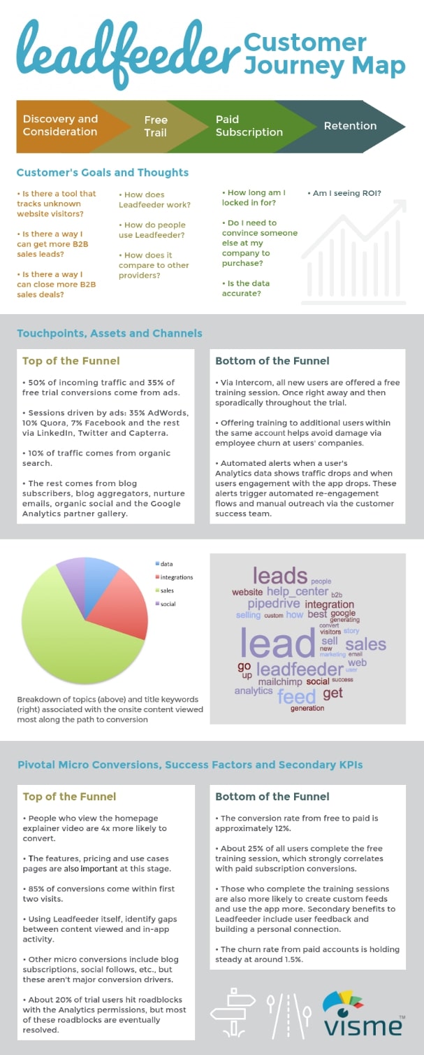
If you are struggling to compile this data, or, lack a CRM that would make researching this easier, you can always interview your customers. Ask if you could have 15-30 minutes of their time to ask them a few questions (you can even compensate them with a $10 Starbucks or Amazon gift card). Interview as many people as you can, but no need to go overboard.
Then, use this data to map out your strategy. This will help you identify the key touch points of your website or the areas your users interact with.
Throughout these touch points, you should be able to map out the emotion, thoughts, goals, pain points, and opportunities each touchpoint needs to evoke.
Answering these questions will help you direct your design. Is their imagery that will help best address these areas in the way you want? What about a particular color palette? Getting started on your customer journey map will help create answers to these questions and better reinforce your design.
2. Remove distractions and reduce friction
Certain elements on your website are going to detract from the value and message you’re trying to convey. Complicated animations, content that’s too long, and “stocky” website images are just a few examples.
With an audience that only has an attention span of eight seconds, you need to make it abundantly clear what your user will learn on the page they’re viewing and your design must not detract from this.
This starts with making sure you have consistent brand guidelines you can work off of.
This should detail your font styles, colors, imagery, iconography, and logo usage. Without this, it’s easy for brands to struggle when designing pages. You’ll likely start to see arbitrary colors and varying font styles and sizes used, which in turn, can distract from your message or create visual confusion for people trying to convert.
It’s also important to avoid too many on-page animations or interactions. If you’re scrolling through a page and see every button pulsing or a section of icons each with their own animation, it can feel overwhelming and distract them from reading what’s on the page.
Let’s take a look at the website below as an example. Note, since I’m treating this as more of a critique, I’m removing the brand’s logo from the image so they can remain more anonymous.
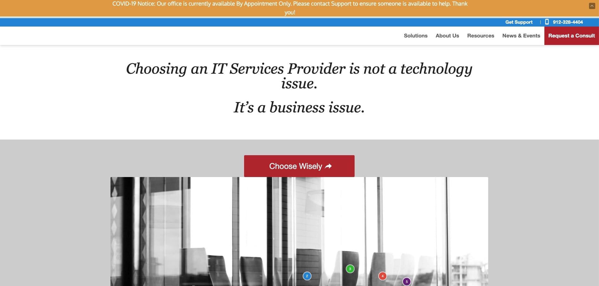
When looking at this site, the first thing I noticed was the colors.
For one thing, the way they are used makes it hard for the user to decide where their eye is supposed to go. Should it be one of the two red buttons? What about the hello bar? Or maybe the top of the navigation?
You need to figure out where you want users’ attention to go when they arrive on the page and what order it needs to flow naturally. This current color arrangement creates friction in accomplishing this.
Second, there are some areas of inconsistent spacing. The hanger in the hello bar (‘you!’) creates a second line that could easily be fixed if the width of the container around the text was increased. The H1 also isn’t exactly vertically centered in the white area, drawing your eye to “issue” rather than the bulk of the message.
In the grey section below the header, they lead with a button (which doesn’t have much context) and feels sandwiched on top of an image. As a user, I’m left to wonder if it’s supposed to have space below, or, if it’s supposed to directly relate to the image. Did the site just load incorrectly? This internal debate creates friction and confusion.
Let’s look at a page that offers a better user experience and abides by brand guidelines.
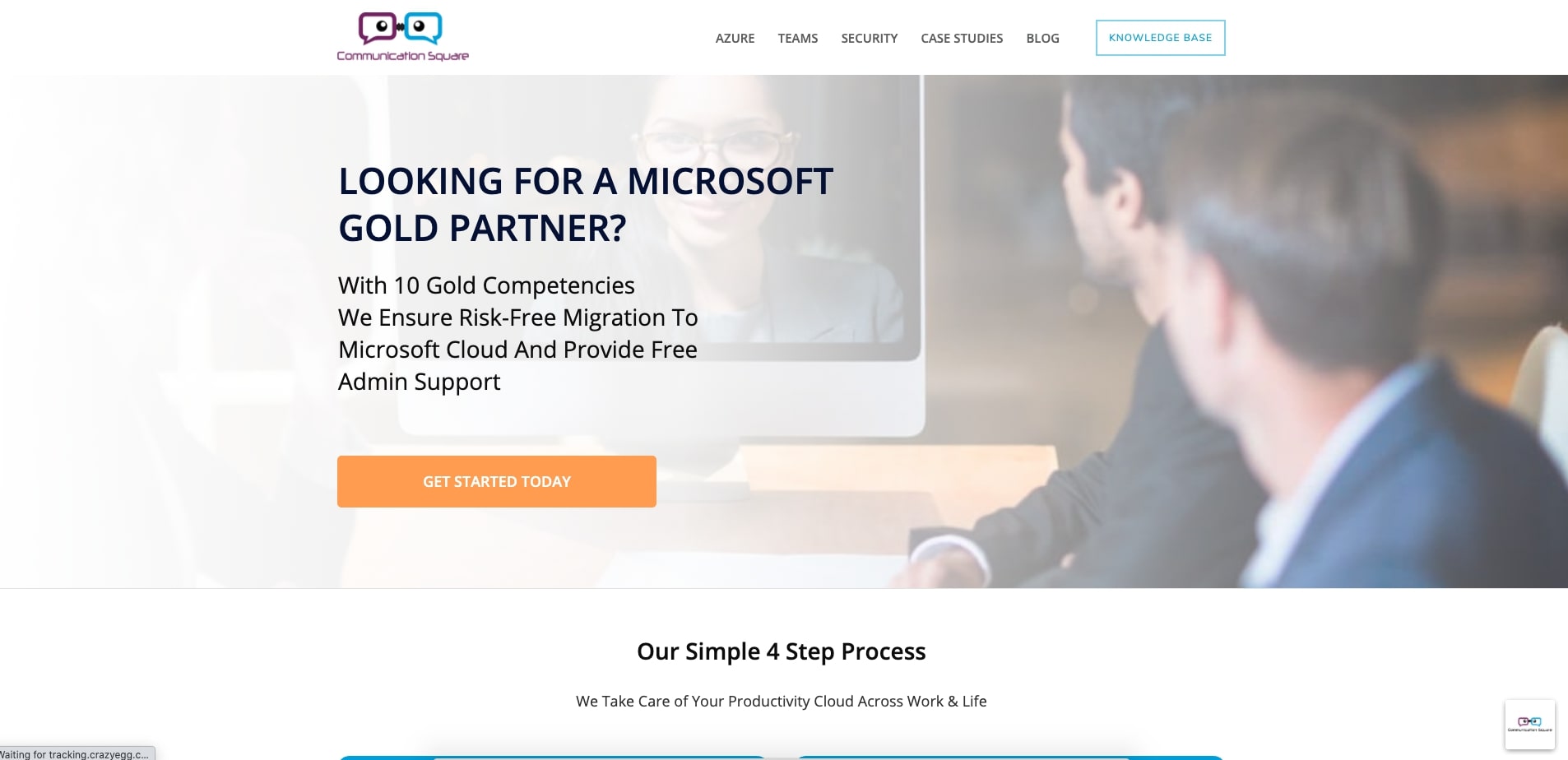
Above we have Communication Square, another company in the IT space. At first glance, this website utilizes a much cleaner look and feel with fewer bold colors and more white space.
When it comes to colors, I like how Communication Square has two button colors, one for the lower priority top or middle-of-the-funnel actions (blue) and one for the bottom-of-the-funnel action (orange). As a result, my eye immediately goes to the orange, the more important action they want me to take.
Their fonts also feel much more cohesive. There looks to only be one font family, used in either a light, medium, or bolded weight. This creates uniformity and makes everything work together nicely.
The hero image overall offers little room for distraction. The fact that the hero image itself isn’t too detailed and is masked with a white overlay allows the content to stand out, rather than it disappearing into the image.
Details like this really help make or break your overall website experience and help your users better understand what you want them to do, leaving less room for confusion.
3. Add social proof
If you shop like most people when you’re on Amazon, chances are you gravitate towards products that contain mostly four to five-star reviews from people who wrote out their experiences with a product.
In lo
oking at these reviews, we gain trust in the product that it will do what it promises and we need it to do, which in turn, pushes us to purchase it.
The same effect is applied to your product or service and website. If users see impactful testimonials from real people, studies show your prospects are 58% more likely to buy your product.
But how should your testimonials visually look so they effectively create that trust with your users when they see them?
Well, there are a few strategies you can take. But first, you need to think about what format of testimonial you want, text or video. Historically, video testimonials have been found to be the best. This is because the medium naturally keeps your user’s attention for longer and also builds a stronger human connection being able to hear voices and see faces of real people.
You also have the option of text testimonials, however, which, when designed and incorporated properly, will still help build trust with your users.
Upland Adestra is an enterprise email and marketing automation software company in the United Kingdom. They have four videos on their testimonial page that are all contained in their own sections.
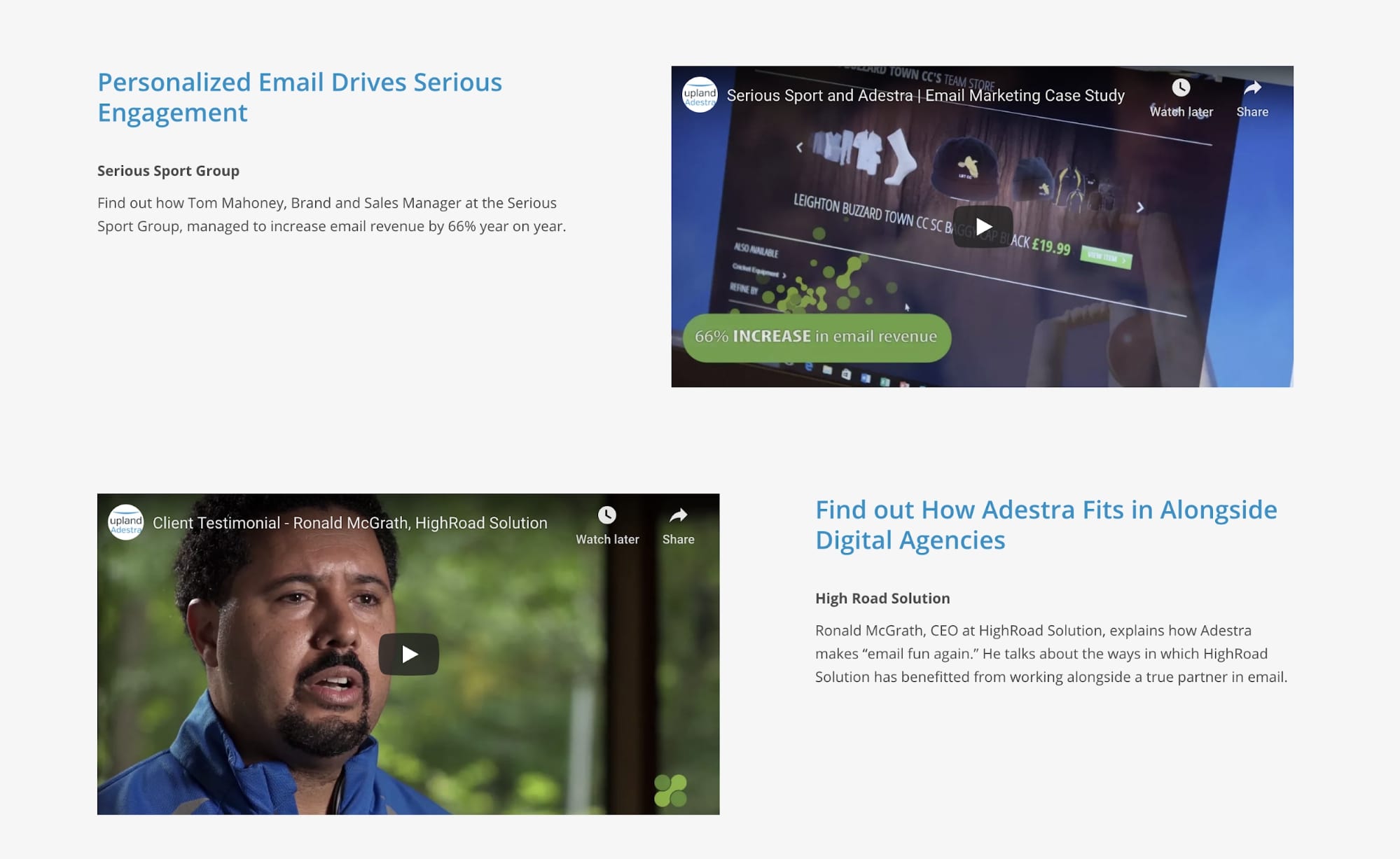
Rather than arbitrarily placing all the videos next to each other, Upland separated them and accompanied them with a header and sentence detailing the result or benefit the client had working with Upland. Now, users have context to what they will hear about in the videos.
I also like how a few of the videos show thumbnails of someone talking, which visually reassures the user that they will likely be hearing from the client themselves, as opposed to watching a text-based video.
If you aren’t yet equipped with video testimonials like Upland, then you’ll likely have a case studies page, where you can talk in detail about everything you did to help your clients.
Zenefits has done a great job of this on its website.
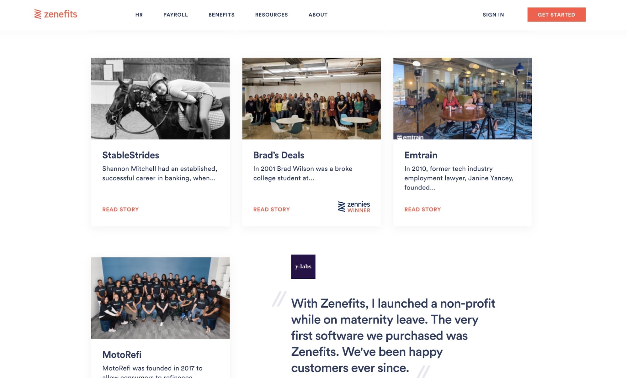
Each card is designed with an image that showcases members of that company, which is way more trustworthy than if they were to use stock photos, or just a picture of their logo.
And because they have five pages of testimonials, they’ve added a filter at the top of the page that allows users to segment what types of industries or solutions to look for. Now, users can find the types of case studies they want faster.

Finally, if your site only has text testimonials without case studies, there are aspects you need to be mindful about when designing them out.
For instance, you can’t just put a set of text testimonials and a name alone. It’s less likely these will be taken as truth since it will leave users wondering what company they work for, what their job title is, and visibly what this person looks like (for visual confirmation that this person is likely real).
Take a look at this testimonial section on Drift’s website.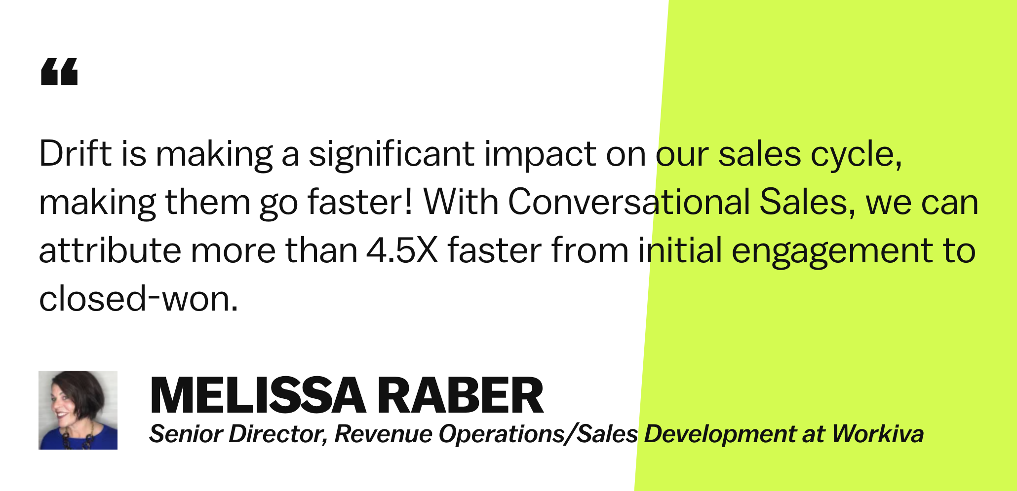
When it comes to places to include testimonials on your website, I always recommend your homepage, service pages, and/or on a dedicated testimonial page that you include in your navigation. Each of these pages is the best touchpoint for people who are either learning about your company and considering buying.
So long as they are genuine, testimonials will better your website’s experience and build trust with your prospects before they become clients.
4. Implement calls-to-action
Once your visitors land on your site (likely through the blog or home page), you need to guide them to places on your website that will help nurture them to conversion. People are lazy, so make this easy for them. Point them in the right direction so they don’t have to struggle to find what they are looking for.
One of the best ways to improve your web design with this in mind to use strategically placed call-to-actions in areas such as the top right of your navigation, below sections that require action, and at the bottom of your website pages.
But don’t lose sight of your buyer’s journey. The easy thing to do on your website is to inundate users with the most bottom-of-the-funnel (BOFU) call-to-action wherever they go, but if someone is not ready to buy, then they likely will take no action at all.
Instead, you should meet your user where they are based on the page they’re viewing.
For example, if they’re on a website, learning about the materials used to build a custom closet, this person is more likely still educating themselves and becoming aware of their problem. Rather than smacking them with a ‘contact us’ call-to-action, give them one to view a comprehensive guide on custom closet building materials. They’ll be more likely to convert as it’s their current concern.
Take a look at a real-life example of this.
The title of it is ‘8 Obvious Reasons You Need a Website Redesign (But Are Still Ignoring)’. Readers who land on this article are likely thinking about a website redesign and are trying to confirm if it’s the best decision for them. So, it only makes sense to show them a call-to-action that will help them learn more about it.
The offer we present to them is an ultimate guide to redesigning your website, where they can hopefully find the answers to almost all they are looking for in one place.
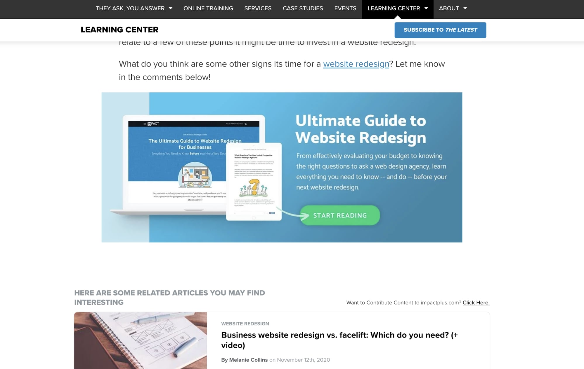
These types of offers also have the benefit of building trust with your users. If these work to educate them, they will begin seeing your company as a thought leader, leading them to feel more comfortable researching your services.
5. Use the right stock images
We always recommend using original photography on your website, but if that’s not an option, there are techniques you can use to help pick out the right type of stock photo.
While stock photos save you the time of producing your own imagery, many websites have imagery that falls into cliche. You’ll also find a lot of other websites may be showcasing the same imagery, which certainly doesn’t help for your credibility.
Users will “subconsciously project their negative experiences onto these stock photos, reducing trust and adding friction to the process” of converting.
So, when choosing stock photos, try to stay away from these cheesy images. These are the photos of people high-fiving with over-exaggerated smiles, groups looking at the camera, executives in superhero costumes, groups of suited people jumping in the air.
When was the last time you saw people in these scenarios in real life?
Look instead for photos that depict realistic scenes in well-lit environments. This could be people in an office talking over a meeting table in business casual clothing, over the shoulder shots of people typing on a laptop, people drawing on a whiteboard in an open room. These are the types of scenes others will start to recognize as legitimate. Look for candid images and ones in real-life settings rather tha
n studios.
So, rather than using photos like this:



Which feel unrealistic for the reasons mentioned above, try going to photos like this:

Or this:
Or this:

Once you find photos like this that you like, you should run them through TinEye to get an idea of how many people are using that photo on their website. If the numbers are in the thousands, it might be best to use a more uncommon photo.
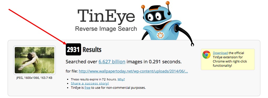
This will aid in bringing more realism to your brand and making sure the images match who you are and what your content is explaining.
You can also check out this article for some awesome stock photo website suggestions if you find yourself struggling with getting more realistic photography on your website.
Being more mindful with your photography will help better represent your brand and how you want others to perceive it.
6. Organized navigation
When designing your website, navigation is key. It’s essentially the map that displays the core places users can visit. It’s how users can easily dive deeper into areas such as your services, products, blog, etc.
There’s nothing worse than a site with a disorganized or confusing navigation interface. Poor design practices such as overstuffing your navigation, using vague or confusing hypertext, and lack or organization can make it hard for your visitors to find where they want to go.
If users cannot find what they’re looking for, they have no reason to stay on your site. Instead, they will certainly bounce and find a competitor that offers a better user experience.
When improving your website’s navigation, it’s important to ensure that your visitors can easily find what they’re looking for. This would include streamlined content, navigation hierarchy, and responsive design, so the experience doesn’t drastically change on mobile.
Take Zendesk’s navigation for example, which includes the most important pieces of information you’d likely want to visit on their website. Products, pricing (this is a must), services, and resources.

Each nav item has ample space so it’s clear where the separation is.
In some cases, like in the image above, the menu item will even have a descriptive line to provide more context to the purpose of that page. The hover effect also makes it clear to the user that these are links that will result in them going to another page.
With one click, users can get to these places with ease, so make sure you’re enacting a similar strategy (without overloading your navigation).
Clean and specifically organized navigations like this let the user know that you want them to have an easy time moving around your website and that there’s nothing to hide. As a result, your users are more likely to visit higher numbers of pages during their session, increasing their time spent on your website.
7. Let your visitors scroll on your homepage
There was a time where we were wary about making our website pages too long, especially your homepage. This was out of fear of users not scrolling, so it forced folks to try and cram what they could into the most common screen size people view their website with.
But those days are long gone. In a recent study by the Nielsen Norman Group, 74% of the viewing time on a website page was spent in the first two screenfuls, up to 2160px horizontally. So there’s no need to be afraid of creating a more robust below-the-fold experience.
Use your homepage real estate to your advantage.
A good rule of thumb is to include three to five sections that help direct new and recurring users to the key areas of your site.
What should these sections be? This list could go on forever, but a quick hit list of some of the more crucial elements includes:
Zenefits does a killer job at hitting many of these points.
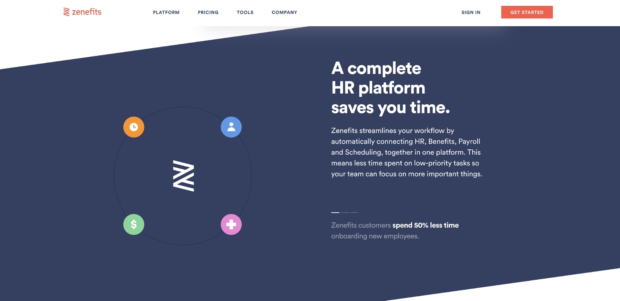
Their homepage offers an experience that walks you through a brief overview of the tool, features of their platform, testimonials, and ending with a call-to-action for a demo.
By the end of the page, users have a great well-rounded idea of what Zenefits can do for them and how clients have liked using the platform.
If you want to go deeper into the anatomy of the best homepage, check out this awesome infographic or this comprehensive article revealing other important homepage elements not mentioned here.
8. Don’t be afraid of white space
Whitespace is an essential design element that helps you break up the page and increase readability. Also called “negative space,” white space refers to the areas around elements on a page that are empty and lacking content or visual items.
Whitespace also plays an important role in the design process and positioning of website elements. While more whitespace can dictate what sections are separate and guide the eye, less whitespace can dictate which elements are supposed to be related to one another due to their proximity.
Vidyard has consistently done a great job with this. Their sections are always separated generously so they fit nicely within your viewport, without too much crowding from any sections above or below.
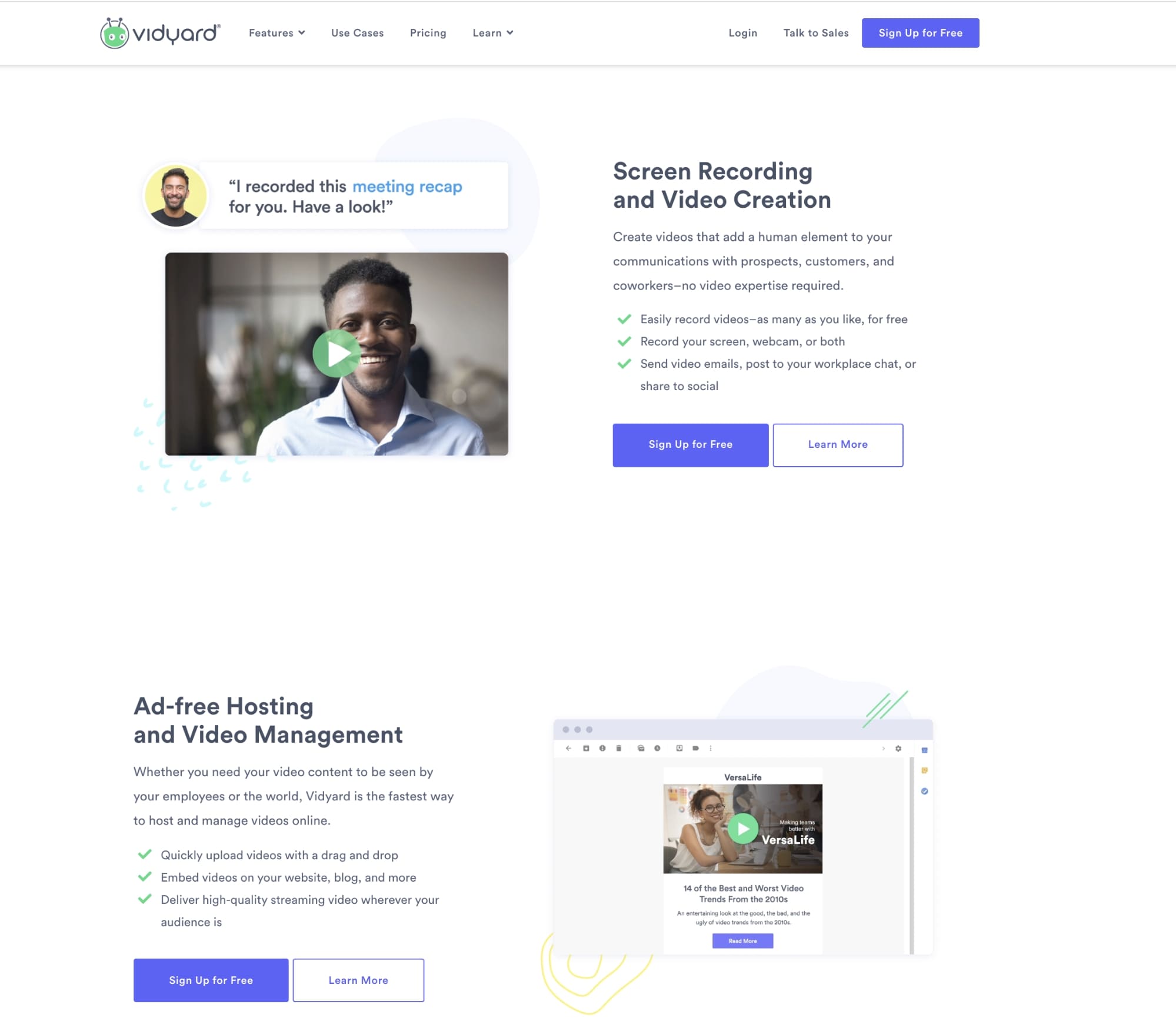
This enables users to focus on each part of a website page piece by piece and instantly lets them know where each section begins and ends. This can do wonders for helping guide your user’s eye to important information such as a call-to-action or value proposition.
If you need further examples of the website doing this well, check out these all-stars to help aid you in your improvements.
9. Mobile optimization is a must
These days, it is critical that you take the time to optimize your site for
mobile.
If you don’t already know, 80% of internet users own a smartphone, and “Google says 61% of users are unlikely to return to a mobile site they had trouble accessing and 40% visit a competitor’s site instead.”
I’d be a little concerned if I were you.
But it’s more than just being responsive visually. It’s a necessity to tailor your site to fit the needs and wants of your visitors. Ask yourself, why would someone access my site on mobile? What things would they look for? Does my experience currently allow them to do those things easily?
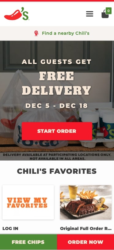
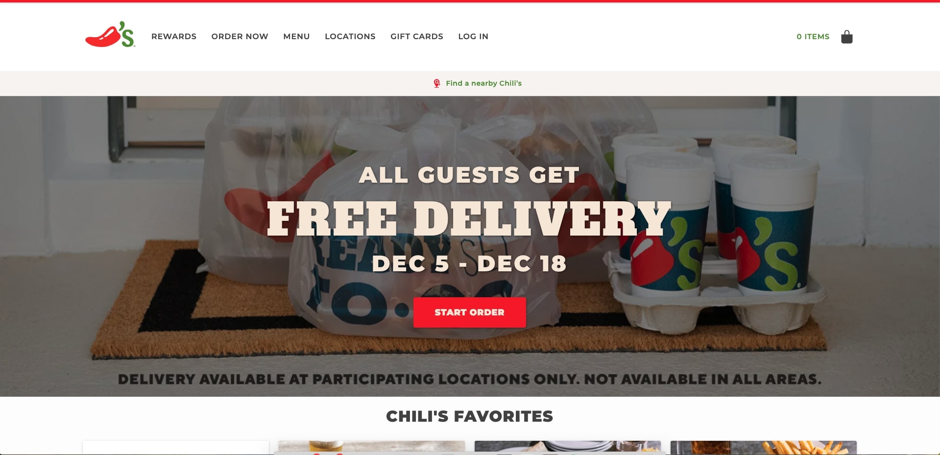
Using Chili’s website as an example, you can visibly see how the desktop and mobile websites are extremely similar. So when users go back and forth between the two for orders over time, there are similarities between the two that make using the website familiar.
They also make it easy to do the core thing on their website, ordering food. The button needed for this is always on screen on the mobile website, so you can order whenever you’re ready without having to go to an entirely different page.
If your website is lagging on its mobile optimization, check out some of these awesome mobile websites to understand how they have created seamless mobile experiences for their users.
10. Make pricing easy to find
Tell me if this situation sounds familiar to you.
You’re currently looking for a new SaaS product online to solve an issue you’re having. For this story, let’s say a project management tool.
You’ve spent the past hour vetting a couple of pieces of software, and think you’ve finally found one that looks promising. With that in mind, you now try to find pricing.
So you click on the pricing page only to arrive at a page that looks something like this:

At this point, you’re likely a little frustrated. You might even be wondering if this means it’s too expensive. What are they trying to hide anyway? Why bother calling and asking?
So now you decide to leave the site and look at the competitors.
If your site follows a similar pattern, or worse, lacks a pricing page at all, you’re going to find your users following this same mindset.
I can’t stress enough how important including pricing is on your website. Including it “enables visitors to complete their research (as any modern buyer wants) and ultimately, qualify or disqualify themselves, preventing your sales team from wasting time on someone who isn’t a good match.”
You may worry that competitors will just try to undercut you, or that your pricing is too complicated to show on your website, but in reality, you should worry more about properly educating your prospects on why your pricing is the way it is and the value you offer.
If someone’s simply looking for the cheapest price possible, regardless, they are likely not a good fit for you anyway.
With this in mind, let’s look at a website that does make pricing stand out on their website. Trello makes it extremely easy for users to figure out what pricing tier they best fit in to and what it will cost the user.
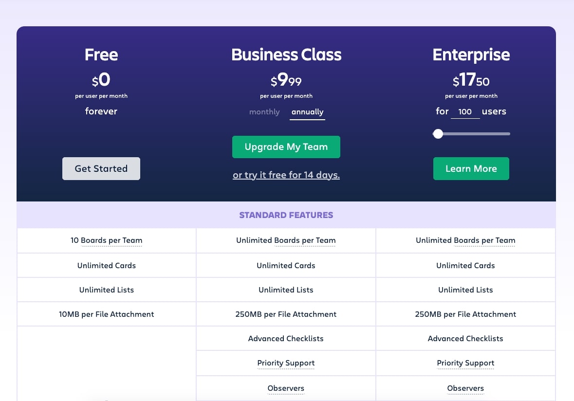
The pricing table has the features included below each tier, so comparing each is as simple as reading left to right. The green buttons utilized in the last to tiers also help draw the eye to those being more desirable options.
To get started on a great pricing strategy, take a look at these sure-fire tips to help guide you.
11. Create a self-selection experience
As someone who finds themselves overwhelmed when it comes to shopping on e-commerce websites, I can’t tell you how happy I am when I find tools that can help select the right things for me.
These tools, called self-selection tools, bring users through a series of questions to arrive at a specific type of result. These results could be a customized quote, product, or an answer to a very high level question (ex. ‘What is my personality type?’).
Tools like this can make it immensely easier for people to understand what the best products or services are for them without them having to navigate through your website to find the answer.
My favorite, seemingly simple tool is Amazon’s product recommendation selector below certain items on the site. Whenever you thumbs up or down on anything shown, the tool instantly changes other products shown in the feed that it believes are closer to what you’re looking for.
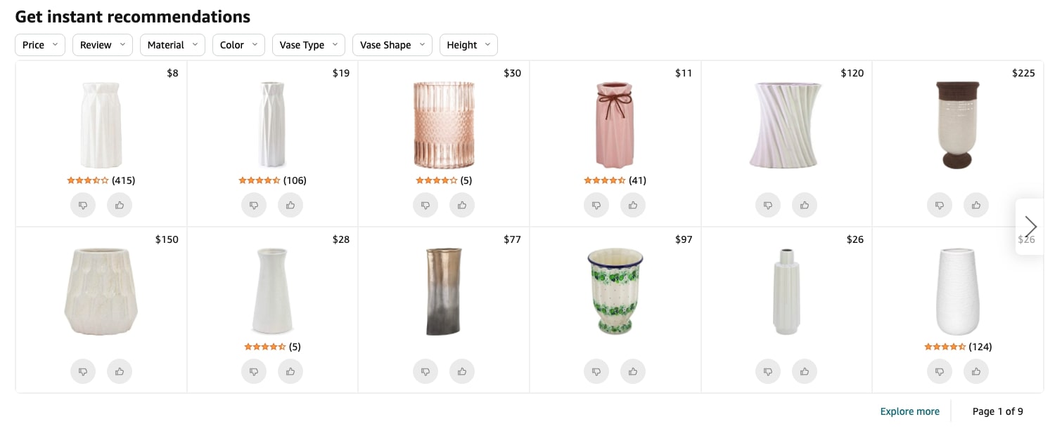 Needless to say, this made finding the perfect vase a lot easier for me!
A less intimidating recommendation tool to checkout is IMPACT client Yale Appliance’s product configurator for the best range oven. This essentially just matches whatever inputs you select and filters through products.
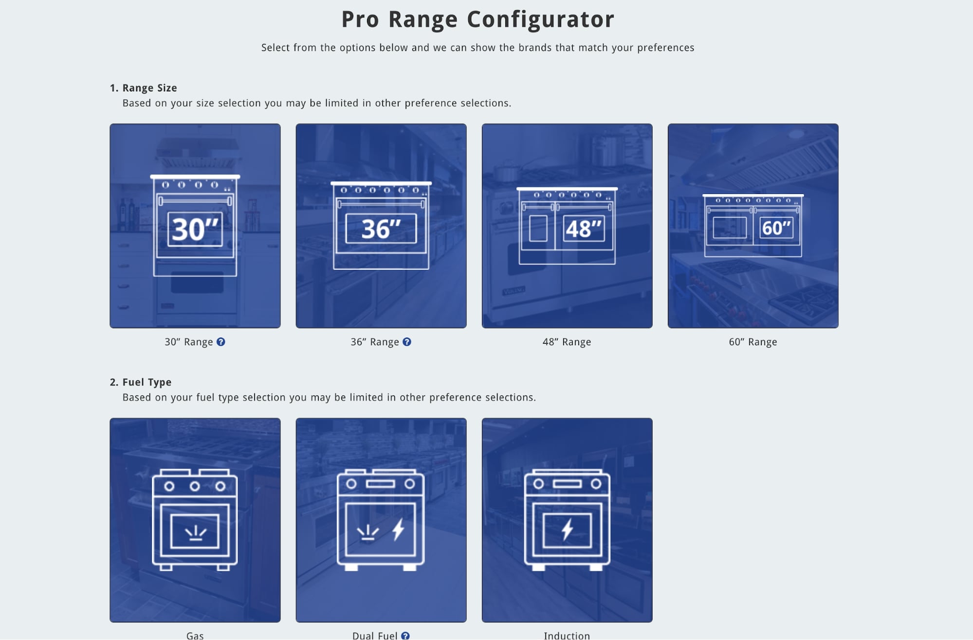
Using detailed iconography, users are able to select which options work best for their situation which results in them being served the best product. This saves users countless hours searching the website and the trouble of calling a sales representative.
Also, the quicker you get what your prospects to what they are looking for, the quicker they might be to purchase it.
While this might be more of a later project, it’s a worthwhile tool that will ultimately help differentiate your company from your competitors and offer a unique experience in your business vertical.
12. Test and iterate
Your website needs to be a living, evolving piece of your company, not static. There is likely always room for improvement. Improving certain areas of your website can aid in improving conversions, time on page, and pages per session, but knowing what solution might work best in improving your website is the tough part.
This is where running A/B tests comes in. Taking two variations of a page and testing them against each other can reveal if certain areas are creating issues for your users.
In some cases, your pages may be performing quite well, but contain outdated information. A/B testing the page can show you how much of an effect the page’s content has on session duration or possibly conversions.
In other cases, you may want to see if design updates could affect a page’s performance. Simple changes such as button colors, headers, or refining copy could make incredible differences in conversion rate.
All that said, other than taking a set-it-and-forget-it approach, especially if you don’t know what to change, you can use tools to create A/B tests for them, multivariate tests, or even set up heat maps to see what users are doing.
Each test can reveal a variety of data that identifies why users are interacting with pages in
particular ways.
From here, I would monitor these tests and tools on a weekly, or bi-weekly basis to see how changes you’ve made are affecting your page performance. Checking frequently also allows you to adjust sooner rather than later if things are headed in the wrong direction.
I recommend checking out professional website development tools such as Lucky Orange or Hotjar for heat mapping, and A/B test tools like VWO, Omniconvert, or A/B Tasty.
Key takeaways
Taking the time to implement these tips on your website can bring dramatic change that can help improve the performance, experience, and customer conversion rates of your website, but once you get some of these tips in place, you may be thinking that the greater project at hand is to refresh your website with a redesign.
Although this is certainly the more intimidating project to concur, you’re not alone in this thought. So, whether you’re not sure if a website redesign is something you should do, or, you just want to get an idea of what it entails, I recommend downloading this ultimate guide to keep in your back pocket.
This way, you’ll be that much more ahead of the game when a website redesign conversation comes up in your organization and you’ll feel more confident with what needs to be done.


